week 19 — 2015-02-07

week 19

In the smart city, the digital technology into citizen’s better public services, better use of resources, reduce the impact on the environment. Smart City is a place of the traditional network and the service is made up of Numbers and more efficient use of communication technology, the interests of the residents and businesses.

The promise of the smart city concepts

A smart city uses digital technologies to enhance performance and wellbeing, to reduce costs and resource consumption, and also to engage more effectively and actively with its citizens.

Using smart sensors to collect data through a smart grid to create a more livable city, viable and sustainable.
There are a few potential problems for smart city:

How the perfect combination of traditional culture and modern intelligent cities?

And if the whole city had “operating system”, and when it goes wrong, what will happen?
An interesting example of a smart city project I found from the Programmable City website:

Urban Resilience in the Smart City: River Flood and Forest Fire Early Detection

Cities around the world are now focused on urban resilience, or the ability to withstand and recover from physical, social, and economic challenges that result from natural disasters, the forces of climate change, congestion, or other man-made disturbances. With the implementation of HAZUR and Libelium sensors, the territory of La Garrotxa can readily manage critical facets of its infrastructure and public services.

Urban and territorial management systems based on wireless sensor networks already maintain and prevent the disruption of essential city services, in Smart City installations across the globe.

La Garrotxa serves as a test bed for managing resilience in a community of 21 municipalities, with a model that other urban areas may readily incorporate. La Garroxta is a region in the Girona province of Catalonia, located between the Pyrenees Mountains and the Mediterranean Costa Brava.

Information from the Waspmote nodes feeds into a city management dashboard to monitor levels of the river, CO2, fire sensors, among the 40 different types of sensors deployed.

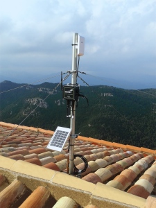
In La Garrotxa, 35 Waspmote sensor nodes power three main application configurations, measuring parameters for forest fire prevention, river flood monitoring, and ambient control, such as air quality and greenhouse gases. In each configuration the Waspmote Plug & Sense nodes are equipped with solar panels and rechargeable batteries, to ensure years of autonomy.

Forest Fire Prevention

In this configuration Waspmote Plug & Sense Smart Environment monitors four different parameters to detect and prevent forest fires, with sensor probes in trees and on rooftops measuring:

  • Temperature
  • Humidity
  • CO2
  • CO

lagarrotxa_resilience_libelium_tree_solar_pannel

Waspmote Plug & Sense Smart Environment sensor node

(source: http://www.libelium.com/smart-city-urban-resilience-smart-environment/#!prettyPhoto)

River Monitoring / Flood Prevention

  • Waspmote Plug & Sense Smart Metering includes ultrasound sensors for liquid flow detection and distance measurement.

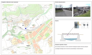
 lagarrotxa_resilience_libelium_riaudaura_river_in_olot

Detail of river monitoring sensor node placement in Olot, La Garrotxa

(source: http://www.libelium.com/smart-city-urban-resilience-smart-environment/#!prettyPhoto)

Ambient Control

  • Waspmote Plug & Sense Smart Environment includes calibrated sensor probes to measure air pollution, gases and the presence of industrial solvents.
  • CO2
  • NO2
  • Air Pollutants I (NH3, SH2, ethanol and toluene)
  • Liquid petroleum

lagarrotxa_resilience_libelium_panel_solar

Smart Environment sensor node can harvest energy and receive new calibrated probes

(source: http://www.libelium.com/smart-city-urban-resilience-smart-environment/#!prettyPhoto)

A city can improve its response to adverse events, and is overall better able to deliver basic functions in good times and bad, to all populations.

week 18 — 2015-02-04

week 18

Critical Design takes a critical theory based approach to design. This kind of design uses speculative design proposals to challenge assumptions, conceptions about the role of objects play in everyday life. 

Critical Design could enable designers and users to devise products and systems with radically different roles and functions. Critical Design focuses on studying the impact and possible consequences of new technologies and policies, and of worldwide social and environmental trends, as well as on outlining new goals and areas of interest for designers. I think what makes design critical is the ability it has to not only engage the viewer, but to provoke further thought and inquiry.

Here is an example of critical design.:

This video called Critical Design – Surveillance + Privacy by Philip Bridge. In this video, it is an analysis of future Surveillance + Privacy.Designing a solution that is not ‘comforting’ but still relates to the user. Makes the viewer think, and discuss the topic in hand. Could this happen? Is this the future?

Shows clear data and analyze the problem and solutions are given. This is a good analysis of the direction and methods。

I think this is a good analysis of the direction and methods.

week 11 — 2015-01-12

week 11

During this semester, we have 6 tasks in Design 1, including culture probe, visualizing ideas and concepts, data visualisation, deep user study, ideation & information design and example pixel-perfect mockups.

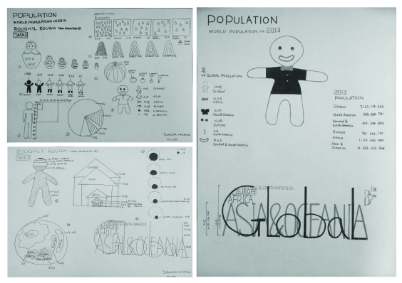
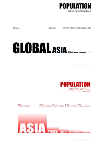
In all these works, I was the most satisfying work is task 3 the data visualisation. In this task, I use the knowledge learned from the reading week. First of all, I choose the data that I want to design,then draw many idea sketches and choose two best ideas from these idea sketches. After meeting with tutor, according to the instructor’s advice modified shortcomings and choose an idea make a black and white poster. Through by printing the black and white poster in class, I learned a lot of knowledge from other students work, but also I realized some of my work on typography in the font issues. For example, visually the first felt attracted to the largest font, giving a misleading sense of it is the title.

-5

Through these suggestions to modify my work, from start sketching to finally complete the work, I enjoy this test and I learned that the poster is simple and attractive. The main purpose of the posters is to communicate a clear message through pictures and effective words. An effective poster catches your eyes and attention. First of all, make poster visible and readable. The information present in the poster should be clear and accurate. Select fonts that are easy to read. Make sure the color and the size of the fonts do not overlap each other. Finally, I have finished this task work, and I’m satisfied with this task.

-1

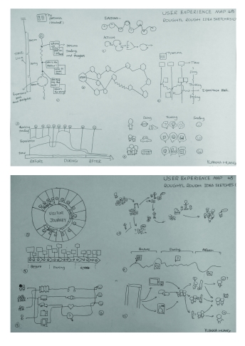
The task I feel especially difficult was doing user experience map. I am particularly difficult task is the user experience map. I didn’t have a clear understanding before the start, about a sketch made a little confused. I focus on creating maps of different styles. I didn’t show my target user journey, from which the problems and how to give a solution.

-2

After meeting with tutor, I realized that I misunderstood this task, I according to our group interview, investigation to determine use crowd and narrow range makes people more specific.

For me, I think all of these weekly readings and video are conducive to my understanding of each task and influence my project. For instance, Week 6 and Week 7 readings. Firstly, the Week 7 this reading lets us know what is a good visual renderings, and analyzes the strengths and weaknesses the work of other designers. Followed by the Week 8, the summary group work in the class, also analyzed the advantages and disadvantages, and learned more about what is a good visual layout.

In summary, I learned and gained a lot of knowledge in this semester, especially task 3 the datavisualisation. I have learned that the poster is a simple and attractive. The poster‘s main goal is to use images or fonts to convey a clear messageAnd a good poster encourages audience to stay and explore your content.

week 10 —

week 10

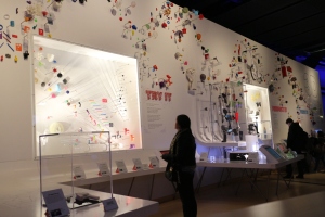
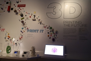
We had a study trip to London Science Museum. We visited an exhibition: 3D printing the future.

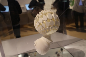
The exhibition’s theme is how to use computer data into physical 3 d printers that can change your life. Displayed on the wall of the exhibition space includes 600 print objects reveals the 3-d printers how to stimulate creativity and groundbreaking design. The visual impact is strong. This was my first contact with 3D printing; its exhibit attracted me.

IMG_5159

IMG_5156

IMG_5161

Some touch screen for visitors to interact, for some applications in the 3 d printing of detailed information. And a video shows how to create a 3 d printer.

This show focuses on the industry’s future, medicine, and the 3-d printing will change your shopping experience.

For example:

1. Lighter and more efficient fuel saving aircraft components in your flight

2. Replacement body parts–from those who have used today, may 3-d printing organs of the future

3. Open source robot, the Carpenter, Richard Van as a consumer to replace his missing fingers.

week 9 —

week 9

After I read an article and a short video about the affordance.

I still don’t understand the meaning of this word.

So I was looking on the Internet for relevant information to help me to understand what it means.

Affordance that’s not a very common word in the digital design world. Functional visibility is a term that describes the relationship between human and object. Supplies were possible when an object exhibits action can make it; It’s not referring to the attributes of objects or people, but the implicit function can make one of the project. The most common example is a teacup. Its physical shape means that you can keep it, you can put the things, you can drink.

What are the affordances of a contemporary smartphone?

I found a good example to explain the problem.

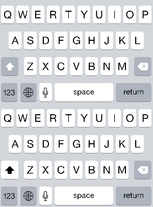
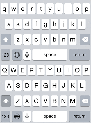
False affordance in iOS7

Apple’s decision to change the Visual state something so trivial Shift-broke Visual affordance to bring the whole experience was horrible for everyone. This simple change actually is a very good example of false supplies because you pressed the Shift key on your keyboard, and you know it’s changed because of the button it changes. However, you don’t know whether the letter is not capitalized.

output_Rdj3zU

Current iOS 7 Keyboard

source:http://www.teehanlax.com/blog/affordances-matter/

output_5WZiaY

Alternative iOS 7 Keyboard

source:http://www.teehanlax.com/blog/affordances-matter/

Digital interface while TV, iPhone or a laptop computer, creating a Visual Designer stores is a conscious choice. Number does not depend on the physical properties of different elements, as you can see, it’s all literally. No help from gravity, shadows or other physical properties of numbers is a serious drawback. Even worse is that supplies design is not often mentioned. More often than not, supplies are growing up when there is a clear lack of iOS7 example. In order to become a better designer, we need to recognize that played an important role in the provision of Visual design, we need to pay close attention to it. ‘S goal is to not make supplies no matter what kind of design you while vases of flowers or mobile phone application menu.

week 8 — 2014-11-24

week 8

Data Visualisation 1 workshop

2.pic_hd

Image 1

3.pic_hd

Image 2

3.pic_hd copy

Image 3

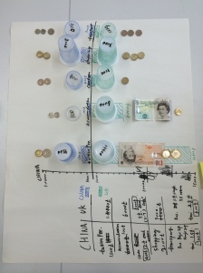
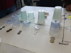
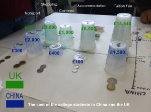
These three images of my group work from Data Visualisation 1 workshop. The image 3, I used the Photoshop add some text to make my installation clearer. We want to present that the cost of the college students in China and the UK.

There are five cost types were compared. (Tuition fee, Accommodation, Canteen, Shopping, and Transport.) As you can see the image 1, we use disposable cups to show the difference, similar to the form of bar graph. Blue stands for consumption in China, and the green stands for consumption in the UK. In this data visualization I think we have 3 points need to improvements, the first point is we have not to give a title to show, we need to give a title to show our purpose more clear. The second point is the background; we should use the blank paper. The last point is that if we use some coins or paper money to expression data it would be great, but we don’t have enough money at that time.

After reading‘’ Creating Exciting And Unusual Visual Hierarchies‘’I have learned that layout is one of most important aspects of graphic design.

Layout design of the size, spacing and position content. Includes details of trademarks, titles, images, text, and so on. Effective layout is crucial to help people quickly find what they are looking for, as well as look visually appealing. Effective layout can make the difference between design, users immediately understand that left users confused and disoriented.

Layout is like in your living room. When you enter the living room, you might experience room, sitting comfortably on the couch. Room should be pleasing to the eyes. But if things are going to be disturbed, you will never again enter the living room. Same with your design. Users enter your design, is easy to pass and to understand what it is . . .

The following is I think a good layout design:

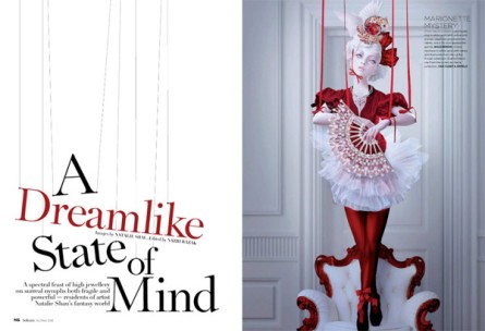
Designed by Natalie Shau

1. Designed by Natalie Shau

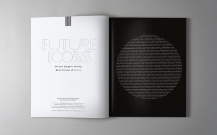
Who’s Jack Magazine Designed by SAWDUST

2. Who’s Jack Magazine Designed by SAWDUST

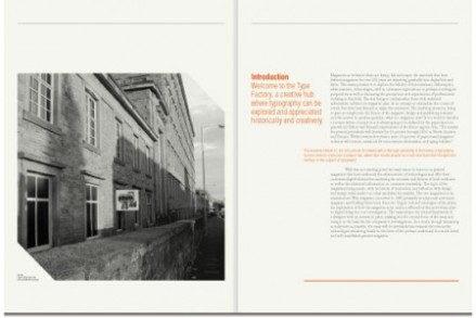
Minimal Publication Layout by - Robert Moxon

3. Minimal Publication Layout by – Robert Moxon

Creative Layout spread by - DHNN

4. Creative Layout spread by : DHNN  

  1. Increased interest and relevance to make font typesetting associated with pictures. A strong sense of visual impact.
  2. Use the geometry grid to layout is easy to attract attention. Single tone keeps simple style.
  3. Use a different color and not unified layout reflects the focus point.
  4. Use double tonal reflect the overall level.
Week 7 — 2014-11-17

Week 7

Pick 2 information or data visualisation from this website: http://www.visualcomplexity.com/vc/

The first example is Underground Map Redesign by KickMap.


Comparing the Official Underground Map and the KickMap London, (Images: 1) the KickMap on the whole more readable, full of information. We can see the right of the images 1, Background combined with maps, let people more clearly understand to each station. I think it is very suitable for tourists.

(Images: 1)

source:http://www.kickmap.com/London/images/KML_COMPARE_L_lg.jpg

The station symbols compared (Images: 2) the top images more intuitive in detail, Compared with the bottom images, the top images given more accurate icon is displayed rather than the abstract, and readability is stronger.

(Images: 2)

source:http://www.kickmap.com/London/images/KML_KEY-FEATURES_lg.jpg

In the images 3, as we have seen, the KickMap found the geographical errors on the official underground map, and corrected.

(Images: 3)

source:http://www.kickmap.com/London/images/KML_SEVEN_SISTERS_DETAIL_lg.jpg

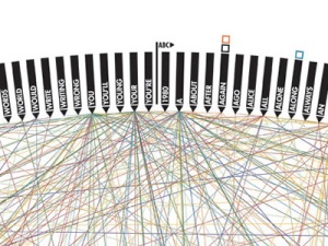
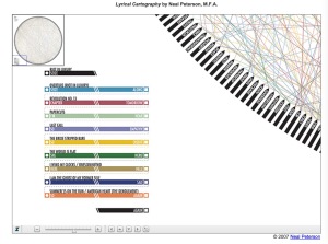
The second example is Lyrical Cartography designed by Neal Peterson.


 737_big01  737_big02

source:http://www.visualcomplexity.com/vc/project_details.cfm?id=737&index=737&domain=

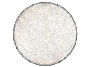
  The project description is the Artist, designer, and musician Neal Peterson has visualized an entire album’s lyrics as a conceptual map. As he explains: “Lyrical cartography is a system which reorganizes and connects lyrical content for the purpose of producing an alternative, visual interpretation.”

  483 words are alphabetically arranged around a circle and tied by a profusion of lines with nine different colors, representative of the nine analyzed songs.

  The first feeling when I saw this image is messy. All sorts of color of line interlaced together makes the pictures very messy, unable to concentrate on some point. Make me bored.

  As you can see on the picture below, although here gives the meaning of each color represents, but I still can’t understand from the picture of the author want to convey meaning. Perhaps my thinking is different, maybe others can understand.

50D8C214-2857-4EEF-BDAF-31F2A41F10A2

source:http://web.ndak.net/kimp/RiotMapFINALprint.html

week 6 — 2014-11-10

week 6

The relationship between print and digital publishing

In the new media age, visual communication nights have been given more space for development, it is no longer a mere manifestation of the plane, more three-dimensional, thinking manifestations appear rich visual representation of existing elements.

By reading Post-digital print: a future scenario learned moving more and more content from print to digital, we seem to be approaching an inevitable turning point, where the publisher will soon launch more than print and electronic publications. A key factor in this development is that electronic publishing is becoming as simple as a traditional publishing – not only for producers, but also due to the new interface, the habits and practices of consumers as well.

Traditional print publishing, on the other hand, increasingly showcases their products valuables and collectibles, through the use of physical and tactile quality of paper. For example, there are many famous novels are limited print edition, which is a new means to attract consumers. If you combine the two with each other, using a variety of new and old media without ideological ties to them in any particular burden, certainly will have the ability to develop new and genuine hybrid publication, by creatively combining the best good standard and digital and print interface.

week 5 — 2014-11-03

week 5

From Post-its to Processes: Using Prototypes to Find Solutions

Before starting to prototype, you must take into account these circumstances and reach a consensus. Determine the objectives of your questions and projects.

Low-fidelity prototypes are rough and incomplete, with certain features of the target product, but in other respects is simple, usually rapid prototyping and testing of production broad concept. You can use paper, pencils, scissors to complete. Because of its simplicity can make all the stakeholders and to encourage trial and error process.

Just-good-enough fidelity means the quality is not too high nor too low, just right that users can grasp the concept or variable and give useful feedback.

High fidelity prototype is close enough to a final product to be able to examine usability questions in detail and make strong conclusions about how behavior will relate to use of the final product.

My contention is that Low-fidelity prototypes, which are just good enough to share with those whose opinions we value. This is all we need, because we prototype to learn rather than to test a theoretically finished product. This allows us to make mistakes faster, identifying areas that can be improved phase can identify and correct effectively.

week 4 — 2014-10-25

week 4

The importance of sketching 

As communication design student is necessary to understand the importance of sketching when they learning and design work.

Have you ever had an idea for a website, design book or application? Yes, I have. For me it’s easy to come up with the idea, and collect a lot of inspiration, but the hard part is how to use these ideas in our design. This is where sketching is useful. Sketching can help you put the idea and inspiration that you collected to try to behave in your design.

When I finish watching the video called

THE IMPORTANCE OF SKETCHING

From: Web Design Fundamentals with James Williamson 

source:http://www.lynda.com/Web-Web-Design-tutorials/importance-sketching/150166/164888-4.html?org=southampton.ac.uk

I realized that the sketch is suitable for everyone; every creative person and even those who are not into design work might have used a pencil or a pen and a paper at some point of their work process. Sketching is especially beneficial during the early stages of design. It gives you more freedom to illustrate what’s in your mind on paper than on a computer.

No matter where you are, a pen and a notebook can record something that you need. Who knows, you might just find notable ideas as you go. On the other hand, your pen and sketchbook in hand can be a great communication tool. Through rough sketches or just showing up your sketchbook, you can easily describe what you do and the creative process what you think.

 Overall, The sketch is very important for the designer. It help you to keep your idea, by allowing you to continue developing; and gives you Clear thinking, more ideas, let you eventually work conforms to the requirements.